Andi Hempton here, I am Head of World Design here at Spot! To keep it simple, I design all the office and event templates that you see when you sign-up or add a new space. I also create custom branded offices or event spaces that premium customers request. If this is something you are interested in shoot me an email andi@spotvirtual.com. But enough about me... let’s jump into some design best practices.
One of the best features in Spot is that we are 3D. This gives off a fun office experience for teams and keeps spirits high for events, but what about when you need to keep it light and sophisticated for those external, more serious meetings? How do you create an experience that doesn’t come off too “game-like?” I get this question all the time when talking to customers. Company culture these days has become paramount to the wellbeing and success of a fast-pace, fast-growing company, and avoiding burnout amongst employees. To combat that, culture needs to be rich and there has to be some levels of fun, but also productivity. This is why Spot is often chosen for remote teams - we provide it all. Plus unlike our competitors, your space can be as professional or fun as you wish.
When working with customers on design, there’s a few key things I want to know; is this strictly a space for your team? Are there going to be external meetings happening inside the space? What’s the overall vibe you’re going for? If the space goes beyond just your team then anyone coming in will be exposed to it all. If the space is meant to bring togetherness, culture and fun I might throw in a hot tub, fireworks, a sales gong and a BBQ. If I know external conversations are going to happen and the customer is worried about looking too “game-like” then we tone it down and help you differentiate amongst your competitors. Here are the top 5 tips I have, no matter your use case, to help keep your space business casual.
Tip ONE: Keep your avatar professional.
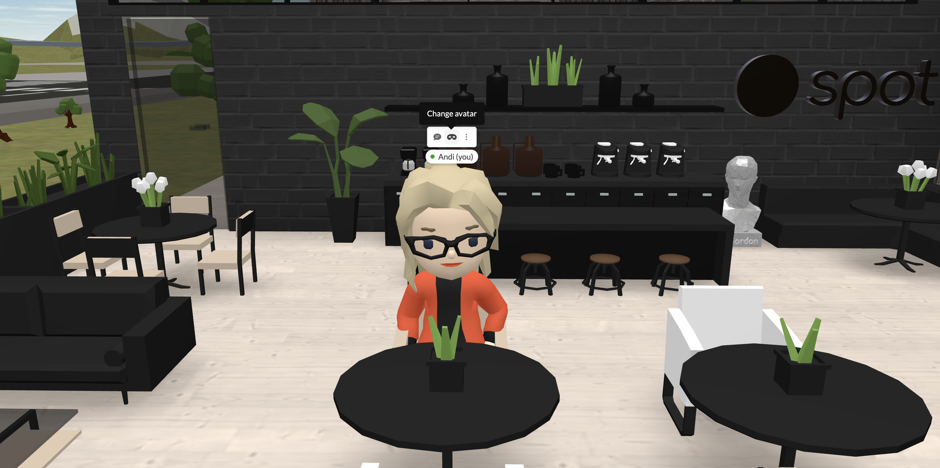
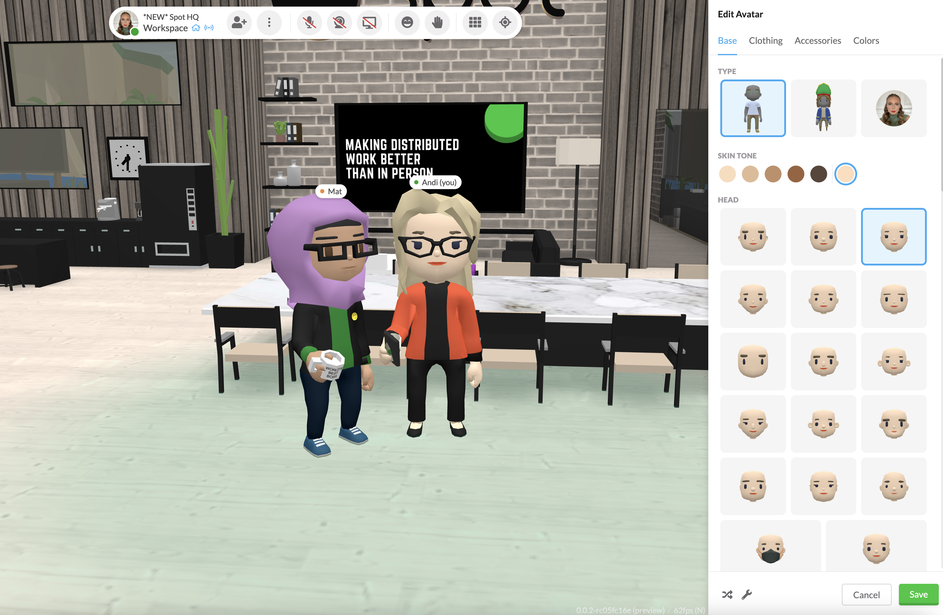
We’ve all heard the age old saying “Dress for Success.” I know the cow heads and vikings are fun day-to-day, believe me we have a blast with them. It's a fun way to bring individuality to the team, but like any important business meeting, sometimes it's good to throw on a freshly pressed suit! You can change your avatar in 3 clicks to match your mood and meeting. Dry cleaning is always on us!
Tip TWO: Keep it Clean.
Spot is visual, so keeping your space clean goes beyond just designing the space. Limiting how much employees can customize the space should be an early decision. Make sure to explore Roles and Permissions in your Team Settings - as it will avoid someone inadvertently changing something seemingly simple, but has far greater impact to the space. A prime example of this is moving walls. An individual's preference of a wall layout and moving it around can have impacts to decor, spatial audio configuration, room name convention and more. Simply put, I advise you to limit the team's ability to edit the space, and to funnel their feedback directly to you, which I’m happy to partner with you on.
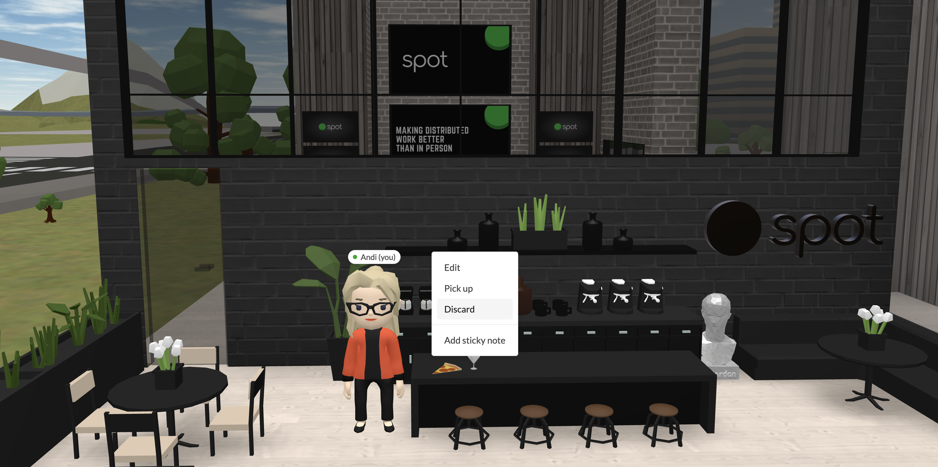
Secondly, doing a bit of cleanup every now and then is a good idea. Cans, coffee mugs, tofu sticks, even slices of pizza will end up all over your office, but don’t sweat it, it means your employees are having fun and interacting! Simply right click the item and “Discard” to delete.
Tip THREE: Colors Matter!
I love company brands, because every single one is unique. Keeping your space simple is a great way to not draw attention away from the important matters being discussed. A great way to do this is keep colors neutral so you are not visually over stimulating your guests. Everyday I’m designing branded offices for customers, and company colors can sometimes be very vibrant, which looks great for websites and print ads, but not great in a virtual workplace.
A big part of my job is choosing colors that are easy on the eyes and won’t over stimulate. I suggest you choose neutral colors first and then add in slightly toned down branding colors trickled throughout the space. Another way to keep things toned down is to not create high contrast, for example whatever color your walls are, make window trims the same color to help blend it out. Personally, I am a big fan of Colorslurp to help me tone down colors. The screenshot below shows an example of brand colors versus a best practice for Spot.
Tip FOUR: Lead by Example.
Having designated spaces for your guests is very important and what you're doing in the moment they enter will tell them exactly what they are supposed to do.
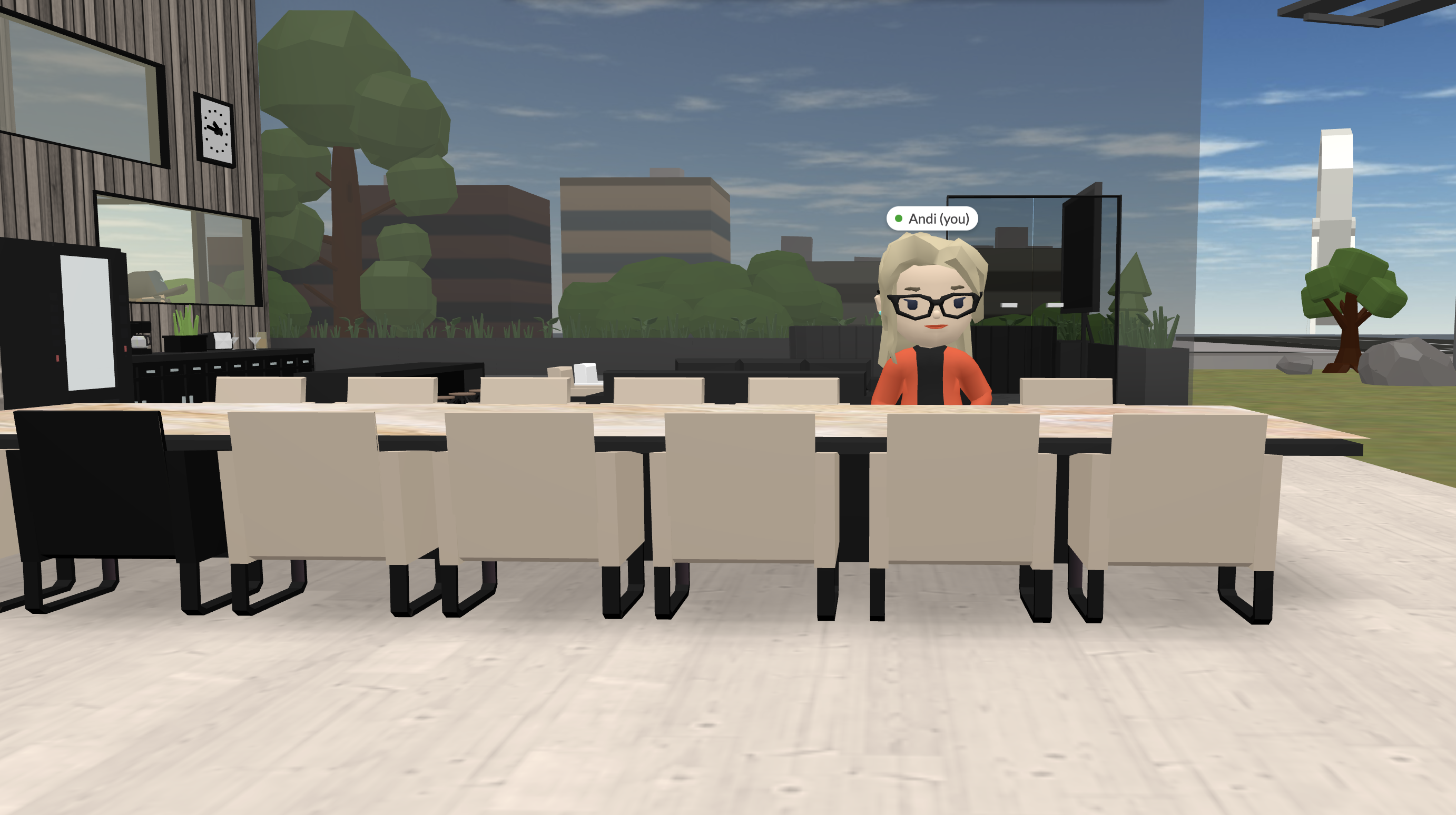
The spatial ratio you have in your office is critical to ensure that everyone feels comfortable - so if you’re inviting people in, make sure the space isn’t too large (making it feel empty) or too small (making it feel cramped). Just like in a physical office, make sure there’s enough chairs for everyone, and start meetings by taking a seat. Also having a proper table and chairs can keep a meeting aesthetically pleasing but also will help your guest understand what they are supposed to do. If you are standing around they might wonder what they are doing in this space if it's not meant to have a proper meeting.
Tip FIVE: Have Defining Areas.
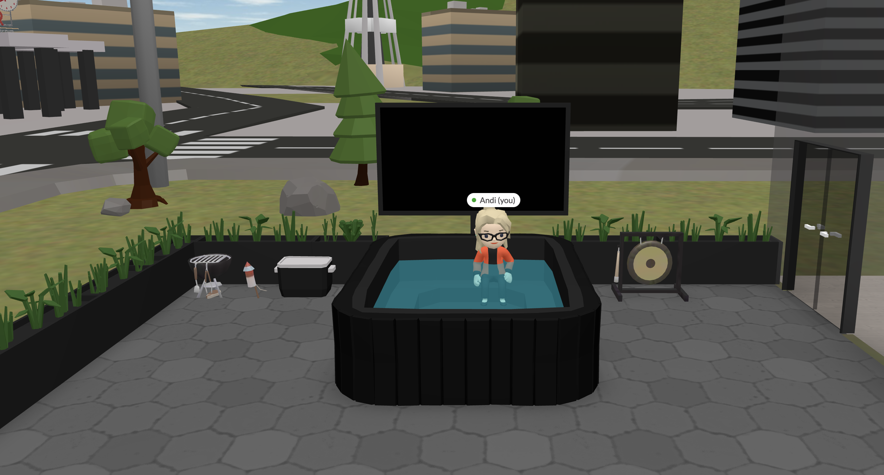
We love to have fun in Spot. Our amazing 3D Director Mat pumps out the best assets, but there is a time and space for that hot tub or sales gong. Keeping fun assets in dedicated areas can keep your team productive and not distracted. We keep all our fun stuff out on our patio for those end of the week team traditions. Ours is called Boot, where we cover our highs and lows for the week, or offer shoutouts to people that helped us out.
It’s also ok to keep some fun assets in conference rooms, for example our magical coffee pot dispenses coffee right in the palm of your hand. It is a fun ice breaker for a meeting, and keeping the coffee maker in a designated coffee area in the corner of the room is a great way to keep it professional and fun.
There’s so much more I can cover, so keep an eye on our blog as we continue to come up with more assets, patterns, templates, and design best practices. Feel free to drop me an email if you want to; show off what you’ve built, need help with anything, interested in a custom office, or want to see my dog :)

